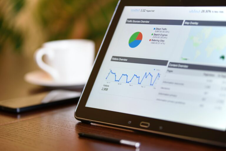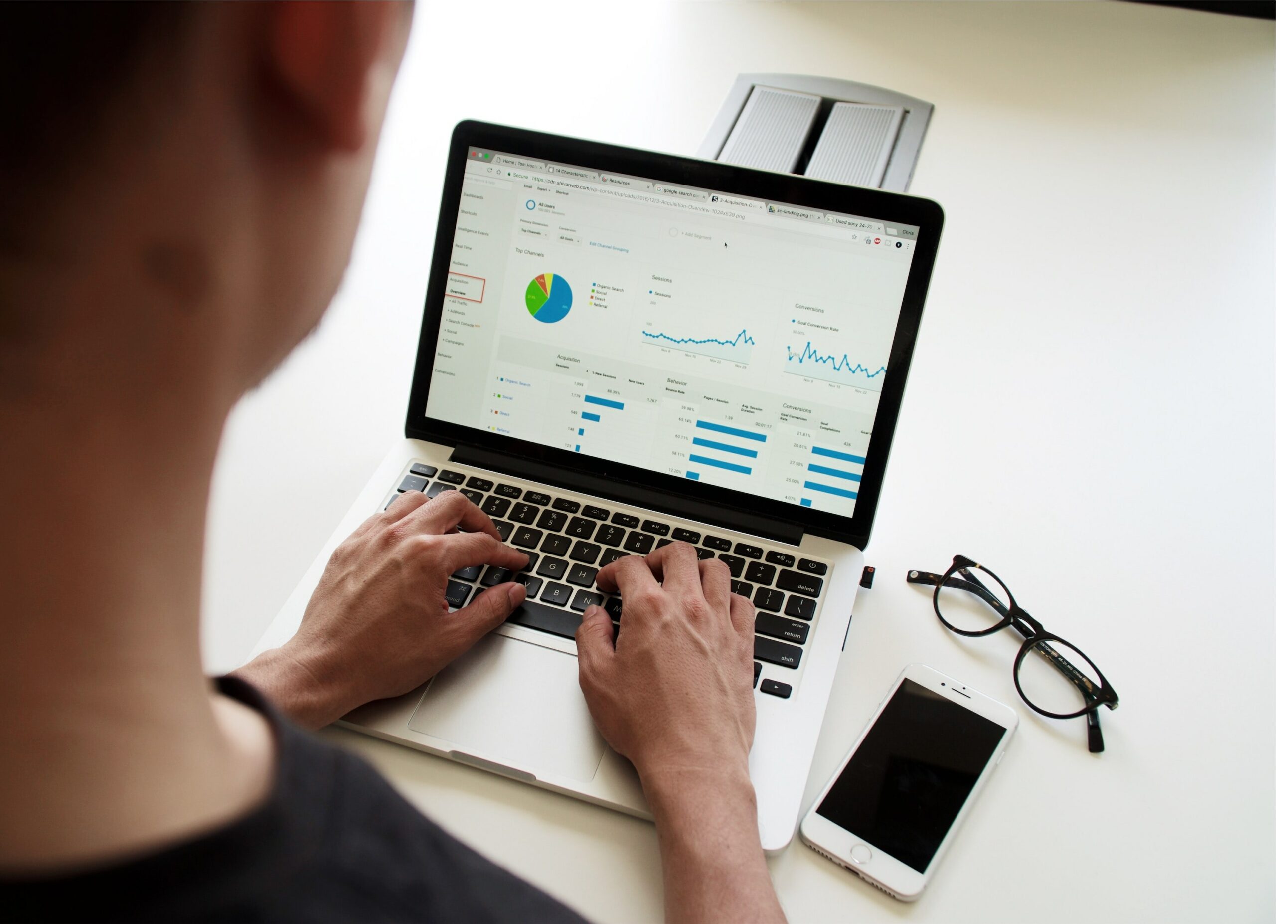
Data visualization is the use of visual representations of data to communicate information. Data visualization allows data to be presented in an easily interpreted visual format, with minimal extraneous distractions. Data can be difficult to understand when viewed in numerical form, but it becomes easier to discern patterns and connections visually. Some of the visual elements used for data visualization are graphs, charts, maps, figures etc.
Visualizations are increasingly being used in learning, decision-making, and creative thinking. For example, visualizations are used across many industries for brainstorming, data exploration, and problem-solving.
Here are five benefits data visualization can have for your business, customers, and employees.
1. Visualizations help you spot patterns. One of the biggest benefits of data visualizations is their ability to highlight trends. Visualization can help identify major shifts in consumer behavior, such as how they respond to certain ad campaigns or how they respond to product changes. The benefit of having a clear view of these trends is that they help marketers anticipate and respond to consumer needs.
2. Communicates complex ideas simply and clearly. Data visualization allows you to communicate complex ideas simply and clearly. Whether it’s comparing sales data from different stores, or developing a dashboard that clearly shows the correlation between employee performance and customer satisfaction, data visualization helps you explain complex concepts easily and effectively.
3. Conveys insights at a glance. From simple graphs to complex interactive graphics, data visualization allows you to convey insights at a glance. When there’s a complex dataset or a vast amount of information, the visuals can help people quickly and easily understand and make sense of it.
4. Improves decision-making. Data visualization makes it easier for people to digest a lot of data at once, which is why they’re commonly used in business presentations. While data visualizations come in handy for presentations, they’re also incredibly useful in business decision-making, where making sense of large amounts of data is crucial.
5. Visualizations help you spot trends over time. Visualizations can also reveal trends over time, providing a valuable perspective on consumer behavior. By showing trends over time, visualizations can help you spot consumer shifts and their impact.
Here are some tools and techniques to help you effectively use data visualizations in your reporting and analytics:
1. Mind maps. Use mind maps when you need to create or reorganize your thoughts. A mind map lays out a hierarchy of information and makes it much easier to see the relationships between and among topics.
2. Dashboards. Dashboards give you a summary of the key metrics for your business. Look for metrics that are easy to understand, and that you can easily change.
3. Charts. Charts are easy to understand and easy to read. Use charts to graphically represent key metrics. (Bar charts, Pie charts, Line charts)
4. Scatter plots. Scatter plots are two-dimensional graphical representations of numerical data. They are great for visualizing linear relationships, and they can be used with any kind of data measuring distances or angles.
5. Treemaps. A treemap is an information graphic that uses a tree diagram to visualize hierarchical data. A treemap can be used to show the hierarchical structure of anything with a natural hierarchy, including organizations, genealogical relationships, or even ideas.
6. Heat maps. Heat maps are a great new addition to the data visualization arsenal. These maps help you visualize large datasets by assigning a specific color for each individual value of a particular metric. Heatmaps make it easy to see which regions have the biggest values and anomalies within large, complex data sets.
7. Venn diagrams. Venn diagrams are a type of visual representation that combines areas in relation to one another using overlapping circles. They’re sometimes confused with pie charts because they can be used for similar purposes, but Venn diagrams are better when you want to show relationships between two or three different sets of data.
Data visualization is a powerful way to present data in a clear and concise manner. We can make sense of large amounts of data very quickly with the help of charts and graphs. Data visualization has proven effective time after time, especially when it comes to better understanding trends and patterns.
Be sure to follow our blog for interesting and informative reads on data visualization and similar topics.